

The Art of Color Harmony: Choosing the Perfect Color for Branding Your Business.
- Sep 29, 2023
- 3 min read
Updated: Nov 13, 2024
Choosing the perfect colors for your branding
In the world of design and branding, the power of color cannot be underestimated. Whether you're wrapping a vehicle, creating a sign, designing a banner, or crafting a logo, the colors you choose play a pivotal role in conveying your message and leaving a lasting impression. In this blog, we'll delve into why it's crucial to select colors that work harmoniously and provide good contrast, and we'll explore some helpful tools to assist you in this creative journey towards picking the perfect colors for branding your business.

The Psychology of Color
Before we dive into the practical aspects of color selection, it's essential to understand the psychology of color. Colors have the remarkable ability to evoke emotions and convey messages without words. Here are a few examples:
Red: This color often signifies passion, energy, and excitement. It's commonly used to grab attention and create a sense of urgency.
Blue: Blue represents trust, calmness, and professionalism. It's frequently used by businesses aiming to establish credibility.
Green: Associated with nature and growth, green symbolizes health, harmony, and sustainability. It's an excellent choice for eco-friendly brands.
Yellow: Yellow is cheerful, optimistic, and attention-grabbing. It's often used to convey happiness and friendliness.
Black: Black signifies sophistication, power, and luxury. Many high-end brands use black to convey exclusivity.
The Importance of Color Harmony
Now that we understand the psychological aspects of color, let's delve into the significance of color harmony when selecting the perfect color palette for your branding materials.
Visual Consistency: A harmonious color palette ensures that your branding materials, such as vehicle wraps, signs, banners, and logos, maintain a consistent and professional appearance. Consistency is key to building brand recognition and trust.
Readability: Good color contrast is essential for readability, especially when it comes to signage and banners. The right contrast ensures that your message stands out and is easily legible from a distance.
Brand Identity: Colors are a fundamental part of your brand identity. They help customers recognize and remember your brand. Choosing a cohesive color scheme strengthens brand identity and fosters a strong connection with your audience.
Aesthetic Appeal: Well-chosen colors are visually pleasing and can attract more attention. An eye-catching design can make a significant impact and leave a lasting impression on potential customers.
Tools to Assist You in Choosing the colors for branding your business
To help you choose the perfect color palette, there are several online tools and resources available:
Adobe Color Wheel: Adobe's Color Wheel allows you to create, explore, and save color palettes. You can also extract colors from images or use pre-made color themes.
Pantone: Pantone is the industry standard for color matching. Their color guides and tools are invaluable for ensuring color consistency across different mediums.
Coolors: Coolors is a user-friendly color palette generator that lets you explore, create, and export color schemes.
Canva: Canva offers a color palette generator and editor, making it easy to experiment with colors for various design projects.
Paletton: Paletton helps you create harmonious color schemes by providing color variations and suggesting complementary colors.
In the world of branding and design, selecting colors that work well together and offer good contrast is more than just a creative choice; it's a strategic decision. The psychology of color, along with the principles of color harmony, can elevate your branding materials to new heights and help your message stand out in a crowded marketplace.
Remember, the tools and resources mentioned above can be immensely helpful in your color selection process, ensuring that your vehicle wraps, signs, banners, and logos not only look great but also effectively communicate your brand's values and personality. So, take your time, experiment, and craft a color palette that tells your brand's unique story.
Now that you've read about how to choose the perfect palette for your branding, you can give us a call and we can get started and branding your business! We look forward to assisting you in creating the best look for your brand.
-C.P. Richard's Signs Team
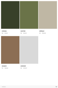
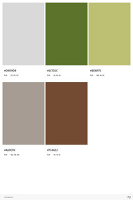
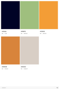
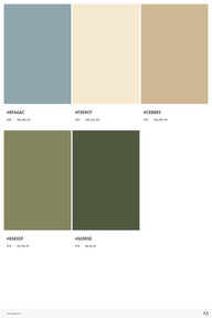
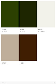
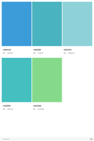
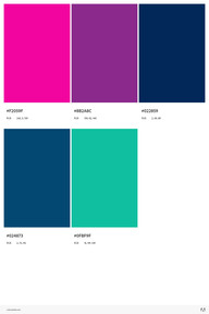
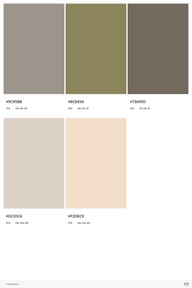
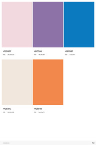
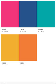
Here are some of our Favorite Color Palettes:


Comments